5 Cutting-Edge Motion Graphic Design Trends in 2018
Motion graphic design is a branch of graphic design that focuses on incorporating various artistic visual techniques into animation. It’s used everywhere, from video games, films, television, mobile apps, and webpages.
Motion graphic design is more than just “animation”, however – because typically, there’s an emphasis on incorporating modern visual styles into motion graphic design, or trying to set new trends. Thus, a lot of popular aesthetic styles you see in mobile and web application, find their way into motion graphic design – in some ways, old concepts (such as minimalism) can be given a breath of fresh life when combined with motion graphic design.
In this article, we’ll be highlighting some of the most popular, cutting-edge motion graphic design trends that had a strong presence in 2019, and will most likely continue through the next year.
Hybrid 2D / 3D
A unique concept that’s been around for quite a while, but is gaining popularity in all kinds of web applications, is the mixture of 2D and 3D artwork. We’re seeing this used more and more lately in animation, mobile games, company logos, and webpage design.
There are numerous ways to achieve this – cel shading, for example, is the practice of making 3D graphics appear 2D / flat by using cartoon-style shading techniques. Cel shading has been used in a huge range of video games (Wikipedia has an entire list of cel-shaded video games), as well as the film and television industry.
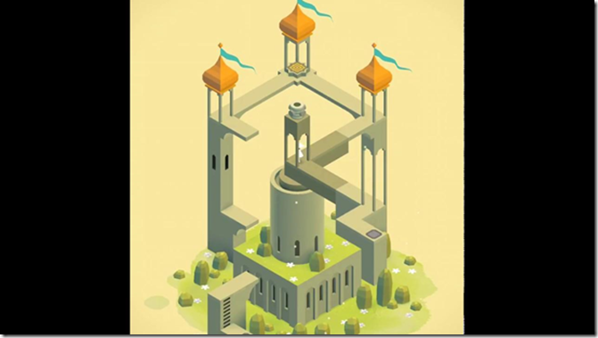
Popular mobile game Monument Valley uses another technique, which doesn’t quite have a name except “2D / 3D hybrid”. Monument Valley’s artwork style relies mostly on the usage of pastel colors, simple geometries, and a few baked (constant) shading effects.

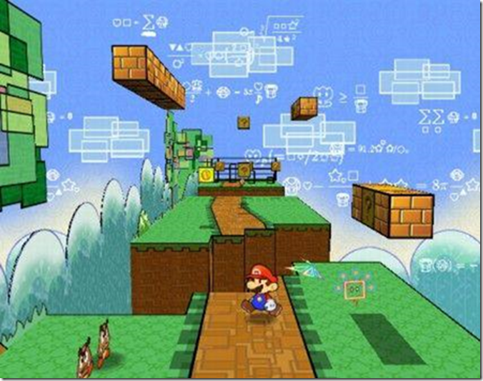
There is also the popular concept of 2.5D, which is typically 3D rendered backgrounds, with a fixed 2D perspective (in regards to video games). A notable example would be Paper Mario, which utilized 3D backgrounds with flat, 2D character sprites.

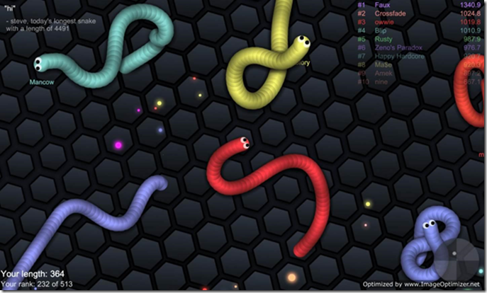
Other great examples of subtle 2.5D shading are found in browser games like Slither IO and Little Big Snake Game:

If you concentrate closely on the color patterns found in both games, instead of the core gameplay, you’ll notice how seamlessly the almost cel-shaded snakes move around on a flat 2D plane, giving the appearance of 3D objects moving along a subtly shaded flat surface.
Gradients
Color gradients are one of those design trends that sound simple on paper (its just color transitions, right?) but is fairly difficult to pull off in an appealing way. This is because its more than just slapping on a gradient background, but finding the perfect blend of colors that fit in with your UI, typography, and other page elements. When you incorporate it into motion design, you unlock a whole new realm of possibilities, such as seamless gradient blending between objects in motion.
Gradients kind of disappeared for a while as flat design (such as Google’s Material Design) took over for a while, but we’ve been seeing more and more well-known brands incorporate gradients into their design. Spotify, for example, notably uses gradients (usually duo-tones) in their UI and promotional material, as seen below:
Animated Typography
Typography is more than just the font you choose – it’s basically artwork from text. There’s a huge range of typography styles – some of the most popular typography techniques in motion design are kinetic typography (moving text), collage typography (masking visuals inside the lettering itself), and animated GIFs where an object morphs into an object / logo (or vice versa).
Typography certainly isn’t going anywhere, as typography in motion design adds such an aesthetic appeal to what would otherwise be flat letters. Sure, you could have a fancy script font – but why not a fancy script font that morphs into your company logo? Thus is the basis of appeal for typography in motion design, and its becoming easier to achieve than ever, as common software like Adobe After Effects makes achieving animated typography really easy for the layman user.
New Minimalism (Nu-Minimalism?)
Minimalism continues to be a strong trend, but its evolving way beyond “ultra simple”. New minimalism focuses on the same “stripped down” aesthetics, but incorporates more vibrant colors, bold lines, and fluid art styles. Thus, new minimalism in motion design may have the same old minimalistic principles, but with extra effort focused towards the animation and blending process, to create a hybrid style that molds the old with the new.
Its difficult to showcase pure examples of “new minimalism” as the trend really isn’t officially going under that moniker, but no doubt you’ve encountered it. It could be in the form of, for example, a minimalistic logo and typography, set against a vivid gradient background.
Liquid Motion
A really popular artistic style, used in all kinds of brands, is liquid motion. Its core focus is on a cartoony, pastel-like palette (in most cases), combined with freely flowing animation transitions with a soft, liquid appearance.
As you can see, there’s a strong focus on abstract color splashes, shape morphing, and almost surreal imagery. Popular freelancer website UpWork has some great examples of liquid motion in their YouTube video series “Hey World”, as exampled: https://youtu.be/YnBA5tMaeZI
Author: Katie Greene is an experienced video games developer. She is a tech geek and love to explore new things. In her free time she likes to read and cook


